
OPORTUN • B2C FINTECH • 2025
Making loan repayments fast & native
TIMELINE
1 month
ROLE
Product Designer (Me!)
TEAM
Design Manager
Product Managers
Developers
Tl;dr
Oportun was routing loan payments through a third-party app. Members left Oportun to pay, which added clicks, slow loads we could not control, and a hit to trust. Online payment completion was down 14% and delinquency was climbing. I redesigned native manual pay and autopay in one month: fewer steps, prefilled amounts, clear breakdowns, saved methods for returning users. One week after launch, the overall payment funnel rose 26.19% and we saw 1,000 more payments, with the biggest lift among delinquent members.
+ 26.19%
Overall funnel
+ 1,000
Payment in a week
SOLUTION
Here are some of the core flows

Easy 3-click payments.
Returning users should feel the process got shorter, not longer. Pay opens inside Oportun. Saved methods, prefilled amount, one confirmation. The flow is built for people who pay online every month and do not want to relearn it each time.
Transparency and user agency.
Users arrive on the payment page from different places, so the breakdown stays visible: what is due, what is past due, fees if any, and how the payment applies. Agency here means no surprises at the last step.
Seamless payments with autopay
Autopay needed to be easy to find and easy to trust. The flow explains what autopay does, and turning it on creates a new secured authorization each time so members know exactly what they agreed to.
OVERVIEW
Oportun is a fintech company focused on serving individuals with limited or no credit history.
Oportun is a fintech company focused on serving individuals with limited or no credit history. They offer personal loans, credit cards, and a savings app, serving a current user base of 2.2 million.

PROBLEM
Oportun used a third-party app for payments, and sending users out of the product reduced trust and control.
Members had to leave Oportun to finish a payment. That break in the flow made the experience feel less secure and harder to follow. We could not control load times or the extra steps inside the external app.
The funnel saw drop-offs because getting to a payment method took too many clicks.
Every handoff added friction. By the time someone picked a method and confirmed an amount, many had already abandoned. Returning users felt the process was slower than it needed to be.
OBSERVATIONS
Online payment completion rate was declining by ↓14% and delinquency rates were rising.
The PM pulled funnel data from our internal tools. Completion was slipping year over year. Late and missed payments were trending the wrong way at the same time. Payments were not just a UX annoyance. They were tied to delinquency risk.

HOW MIGHT WE…

Help users pay their bill efficiently?
User goal
Reduce delinquency?
Business goal
DESIGN PROCESS
I mapped the full payment flow first: where users landed from, where it broke, and how many steps it took to pay.
I traced every entry point into pay: home, loan details, reminders, past-due states. That map showed where clicks stacked up and where people dropped before reaching a payment method.
I split the work into two flows: manual payment and autopay.
Manual pay needed to feel fast for someone paying once. Autopay needed to feel trustworthy for someone setting up recurring payments. Each had different anxieties. Manual pay was about speed and clarity. Autopay was about knowing what would be charged and when.
Each flow had to feel native to Oportun.
The bar I kept in my head was closer to how iOS opens Maps from another app. You tap an address, Maps launches with the destination already set. Your location is already known. You did not retype anything or land on a generic home screen. It is technically a different app, but it reads as one continuous action. That is what native should feel like: context travels with you.

Alternate methods came with clear steps, honest tradeoffs, and nudges.
Members reach out to support during moments of uncertainty around payments, balances, or offer eligibility. When the product doesn’t clearly answer these questions, confusion leads to delayed.

DESIGN DECISIONS
Knowing when to add redundancy and when to remove it was key to feeling transparent without overwhelming users.
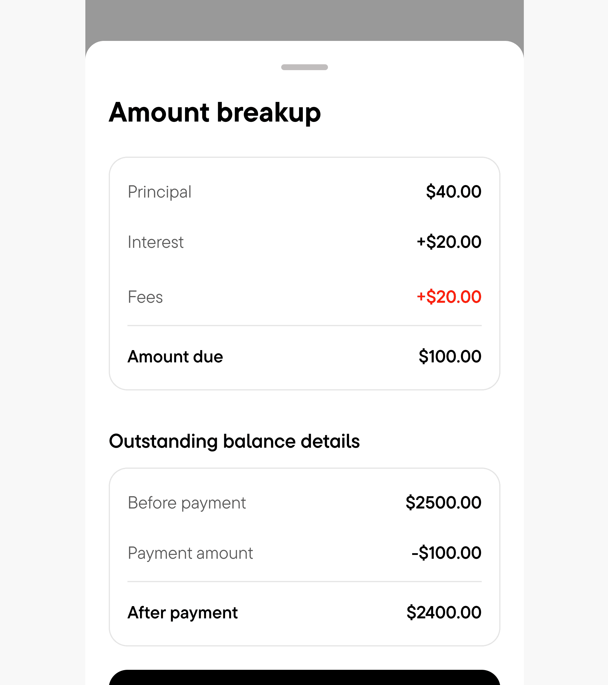
Transparency to amount breakup
People enter pay from home, a reminder, or a past-due banner. I kept the amount breakup on the payment screen anyway. Repetitive on paper, necessary in practice. Nobody should confirm a payment without seeing what they owe.

Prefilled payable amount
The due amount loads by default. Change it if you need to, but most members does not need to retype a number they owe.

Faster checkout cues for returning users
Saved methods and a familiar layout. Open pay, pick your card, done. Three clicks for someone who pays every month.
OUTCOME
Payments improved drastically in a week, especially for delinquent users.
+ 26.19%
Overall funnel
+ 1,000
Payment in a week
REFLECTION
My key takeaways and learnings!