


Users feel overwhelmed with too many features.
“I don’t see the point of two color editors, it always confuses me.”
STREAMLINE • B2B SAAS • 2023
Redesigning Streamline's asset library for better workflow
TIMELINE
4 months
ROLE
Product Designer (Me!)
TEAM
Founder
Growth Marketeer
Developers
Tl;dr
Streamline is a B2B asset library used by designers, marketers, and developers to browse, customize, and export icons and illustrations. The product had strong assets but weak retention (5%) and conversion (0.9%). I led a four-month redesign focused on simplifying workflows, improving findability, and making value easier to see. After a 5% rollout with HotJar monitoring, feature discovery rose 46%, user retention rose 13%, and conversion moved up about 2%.
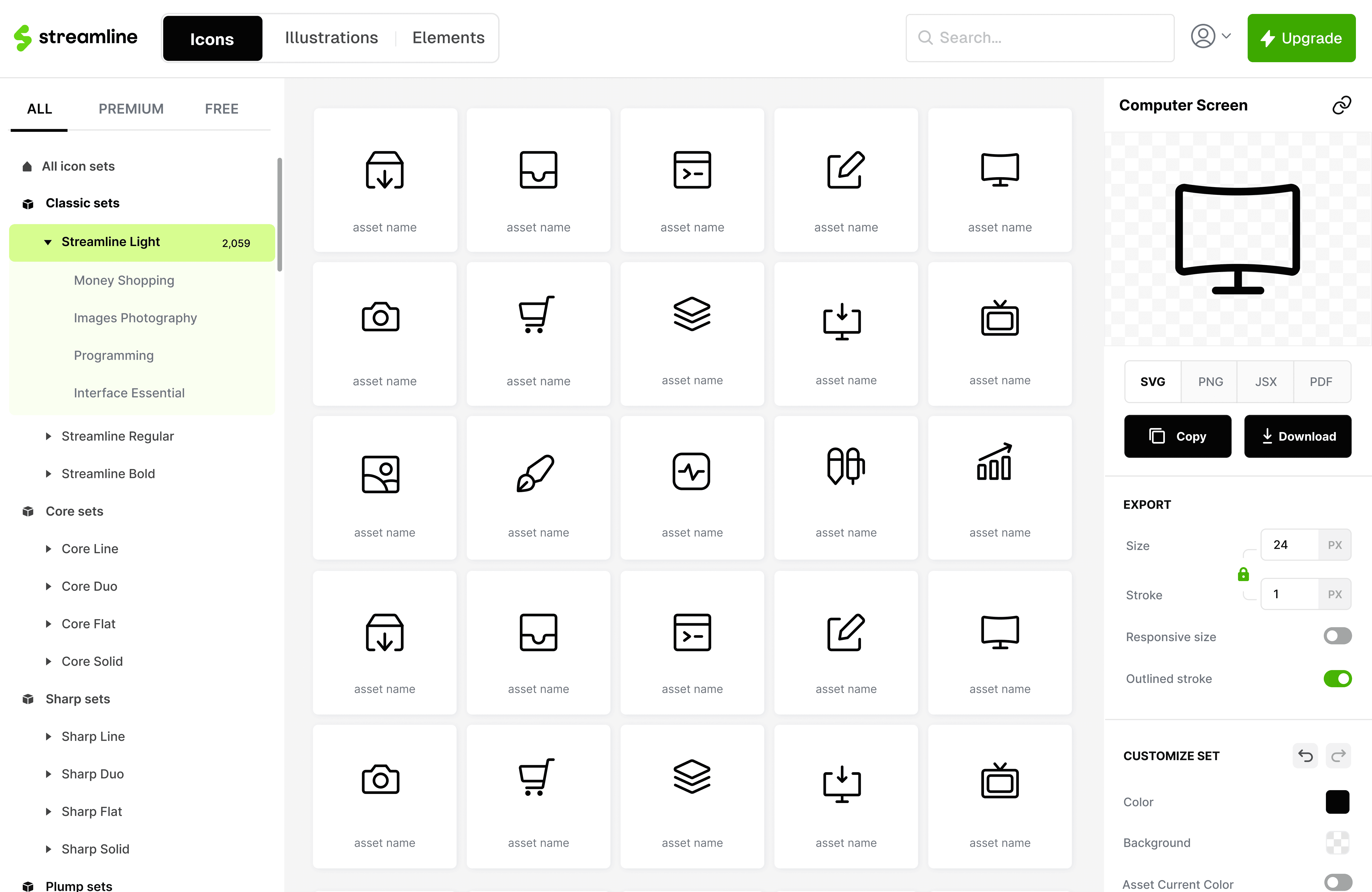
FINAL SOLUTION & FEATURES
In 4 months, the Streamline app was ready for launch.
https://streamlinehq.com

OVERVIEW
Streamline is a B2B SAAS asset library with millions of users.
Streamline is a design tool built around a large catalog of high-quality vector assets like icons and illustrations. Designers, marketers, and developers use it to browse huge sets, drop assets into collections, customize them, and export in the formats and sizes they need for products, decks, or code.
PROBLEM
Even though Streamline offered high‑quality assets, users weren’t retaining or converting.
Streamline’s asset library was already strong but the app wasn’t turning visits into habits or paid plans. Retention was low and conversion sat around less than 1%, so revenue didn’t line up with how good the assets actually were.
LEARNING FROM DATA & USERS
Out of curiosity, I wanted to dig deeper into the existing data to figure out what the missing piece was.
I started with what we already had in Mixpanel for the last 30 days. The funnel made the gap obvious: plenty of traffic and sign-ups, then almost nobody on the upgrade step. A separate view of feature usage showed the same story in a different shape. Search and the color editor got real use, while a long tail of features barely moved.


That still did not answer the 'why,' but it directed me towards the real users.
Mixpanel helped understand where people dropped and what was underused, but it couldn't explain the low metrics. I leaned on people with low engagement or stalled conversion so we heard fresh friction. I still ran a few calls with power users so we didn't break workflows that already worked and understanding why they liked Streamline.
The findings revealed more pain points than I expected and it changed the scope of the project.
The project began as a conversion push and expanded into layout, findability, and end-to-end flows.
Once research showed the app was hard to use, I had to decide what I would and would not try to solve in this project. I brainstormed with Vincent, Khushi and Victor about how to go about with this redesign. I was left with a list of things I could improve, and a list of things to build from scratch.
DESIGN GOAL
Earn conversion by making Streamline useful in real workflows.
DESIGN PROCESS
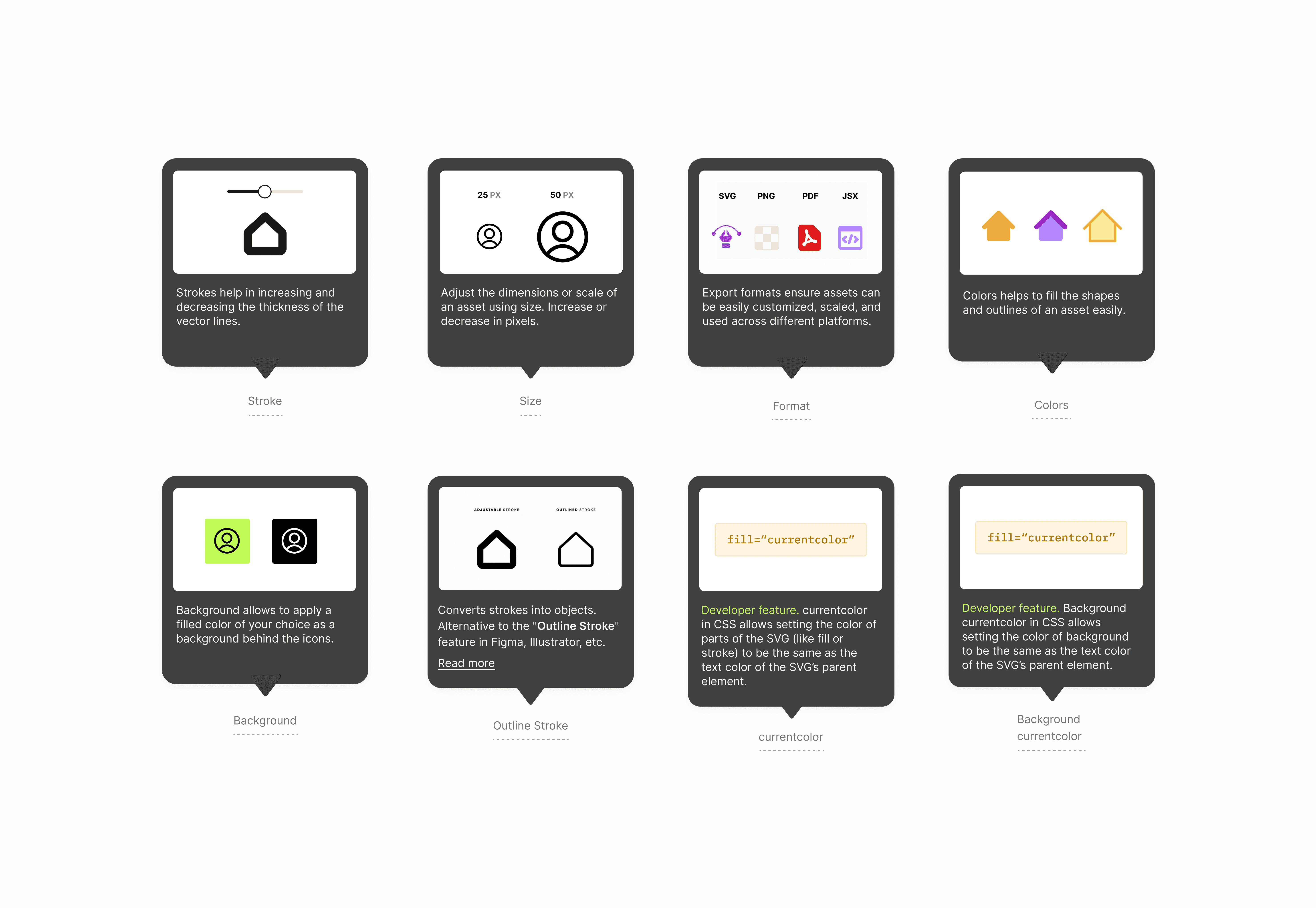
Thinking through the layout was the most important part, both to simplify the workflow and highlight the perceived value.
By the end of the process I was left with multiple explorations and a design system.
I went ahead with the three-column layout because it gave access to discovery of sets and customizing assets at the same time.
Then I dove into each feature, exploring them individually as standalone experiences.
By the end of the process I was left with multiple explorations and a design system.
TESTING
We launched the new version to 5% of the light user pool and kept our eyes fixed on HotJar recordings.
We fixed internal details and SEO issues before opening to a small user base. Three days in, recordings showed a clear friction point: people were struggling to find export formats because options lived inside a dropdown and were easy to miss.

3 days post test results, exports dropped by ↓ 29%.
The early numbers showed that users were struggling to find format options because the options were displayed under the dropdown, making them much harder to spot.


IMPACT
Feature discovery increased 46%, which was a big win, but conversion did not move as far as we hoped.
WALL OF LOVE
The new version of Streamline received a lot of love online!
REFLECTION
My key takeaways and learnings


